Wednesday, October 13, 2010
Up to the Challenge!
The only constant is the talent. Pools of creativity that seem to find their way back together in one form or another. Reconnecting to form new well springs of exceptionally creative thinking.
Insomniac Games is one of those places in my opinion. An amazing company which seems to have found a way to preserve, nurture & create incredible entertainment product.
Perhaps I'm bias in my view, because I have a small group of friends from my Disney Interactive days who have brought their collective talents to bare on some very compelling Brands there, in: Ratchet n Clank & Resistance.
So enter the five year cycle. On yet another down swing in my career, I decided to try and recapture that sense of creative fire I felt when I was in the Gaming world. A feeling absent from my work far more than I had desired over the recent years.
However, a few nagging questions kept coming to mind: Has too much time pasted since I had been involved in this arena? Could I still have something to offer of any value? Has technology advanced beyond my current skill set? All of these real concerns for me. Ones that could easily have kept me from even trying to apply. But with a reminder of a few cherished quotes hanging on my wall. . .
"You have only failed, when you have failed to try" & "The only mistake you can make in life, is to constantly be afraid you will make one". I put my concerns, my fears & my doubts aside and went for it.
With the help & expert advise of some very good friends of mine @ Insomniac, I was given a chance to take a test to see if there was a fit for my style of design into the "Resistance" franchise. Admittedly, very realistic in its shape language and design approach. Something outside of the body of work I had been used to producing.
But a challenge I looked forward too. No different then the curve balls thrown at me day in day out. Sure the time line was tight for what needed to get done (show research, thumbnail studies, full layout that tells a narrative, complete render & finally a prop pulled out of the design with mechanical turns) all this in 7 days. Full time job or not, I could get it done. I WILL find the time. After all, all nighters certainly were not foreign to me.
I spent Saturday & Sunday, doing my research & roughing out some thumbnails. Monday through Friday I spent every waking moment toward the final designs, page layouts & final render. Between my full time job and this incredible opportunity, I clocked only 11 hours of sleep in that last five days of work.
Tired & proud of what I had accomplished, I submitted my work & hoped for the best. Well here's one more quote for you: "there is no shame in getting knocked down, only an opportunity in character for those who have the strength to get back up". I guess you can tell by now I didn't land the job, but I am SO grateful for some very good friends of mine providing me with the opportunity to take the shot. These guys are amazing in my eyes, in there artistic talents and direction, but more importantly in the friendship! Brent Wittington, Chad Dezern & John Fiorito . . . I can't thank you enough!!!
Wednesday, September 1, 2010
Here's the Pooh-Ppp . . .

Here is a collection of some small & very quick sketches of "Winnie the Pooh" (Pencil & Whiteout).
There was a time during my employment at the Disney Stores when management responsibilities & work load, kept me from doing what I loved . . . illustrating.
So to combat this trend, I would take an hour before each work day to sketch out these little thumb nail illustrations. Since the larger projects were just too big to fit into my busy schedule, I decided to work at a size I could complete.
These little successes were just what I needed to fulfill that desire to stay in touch with my creative roots, while filling a growing void. I have tried to keep this practice going till today. Since life will always continue to throw things our way, we just need to adjust the scope of what we can actually accomplish. Don't loose heart, just organize your goals into manageable steps.
I would be remiss if I didn't take this opportunity to jot down a few thoughts about "THE STORES". Through collaboration, a great deal of growth came to me in my employment there. I had gained some very dear friends in the process. I had the privilege of learning under some very talented, insightful & patient individuals, from my bosses (Designer-Directors, Mentors): Ed Rodriguez, Jason Bahret & Bob Prado; to some of the most inspiring co-workers anyone could ever hope to work along side, with: Chris Schnabel, Ben Butcher, Kevin Kidney, Jody Daily & Joel Andrews, to name just a few.
The priceless reward from working in this kind of environment, is that you gain so much creative growth through the personal guidance you received from your teammates. We helped each other out over any area of difficulty. We shared techniques, creative insights, love for art & artists (old & new). For books & toys (man the money we spent, but the libraries we gained). There is a strong sense of family that develops, which lasts beyond the actual stay there as an employee.
As I get older, I realize more & more, the importance of maintaining these relationships. Not so much for the creative support, although that is ALWAYS present, but more so because they have become an important part of my life. We live, we share, we create & are hearts are filled. Art may be an individual adventure, but its personal value is increased ten fold when it is shared with others.
Enjoy!
Labels:
Disney,
Illustration,
Layout Design,
Pooh
Reflections of Pooh . . .


This series of work was for a freelance job I got from Disney Art Classics. It was a limited print run for a poster called "Reflections of Pooh".
The work shown here is from the early roughs, to some of the cleaned line art. To the watercolor painted color key & the render test to verify the final technique.
This final technique was a last minute change requested by the Art Director, who liked the style of a very early comp I did at the beginning of the project. I was not originally planning on such defined ink lines, but in the end, it was a great call.
Labels:
Disney,
Illustration,
Layout Design,
Pooh
Tuesday, July 20, 2010
Little Tikes, Big Rewards . . .


This project was a creative diamond in the rough. I had been waiting years to be involved in a project that provided such a strong sense of pride & accomplishment as this one did.
I had the real pleasure of working with two very special individuals, Ed Rodriguez & Debbie Middleton. The creative chemistry between the three of us, was perfection. Each of us had the greatest respect for the others strengths. The exchange of ideas, the conceptual flow as we worked through solving problems was effortless. Even though this task of developing Entertainment was like adding another full time job on top of our Product Development responsibilities, for me specifically, the enjoyment of this type of project was more than worth the insane schedule.
One of the greatest advantages of working on an Entertainment property for a Toy company is that you get to wear so many hats. Our involvement spanned from story creation & review of its development, through storyboard & animatic into rough & final animation, all the way through to the final edit. We drove the Visual Development from Character to Layout Design & overall shape language for the brand. As well as the direction of lighting & color. Our partnership with Mike Young Productions & the very dedicated & talented crew there, brought the vision to reality.
Needless to say, the process although compressed with in a very short time frame, was one of the most rewarding I have experienced in my career. I hope the future holds other journeys just like this one & with the same cast of creative characters, that of my very good friends.
Labels:
Layout Design,
Little Tikes,
MGA Entertainment
Shape Language . . .

Visual consistency is very important on a project such as this. We had 4 shorts, although staggered in the schedule, they were at one point all in production at the same time. Each short had some aspect of its design handle by different Artists, a necessity when dealing with the sheer volume of work. These Design style sheets communicated overall shape language & were key to making sure the entire team was looking at every design solution with the same goal in mind. The ideal outcome was to have the whole project look as though it was created by one hand. Here is an example of one of the sheets from the short "Bubble Trouble".
Filling in the Details . . .
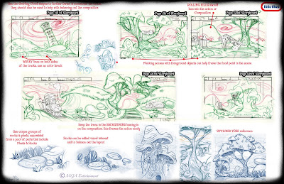
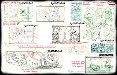
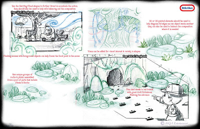
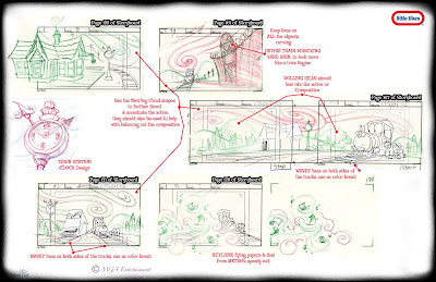
Since the production schedule was so compressed, with a very small window for design comments & corrections, we used the storyboard phase to effect lighting, staging and the adding in of missing elements from props to full blown backgrounds. If we didn't catch it here, there was no time to go back & add it in later. Here are a few examples of how I communicated these adjustments.
Color Direction . . .


Mike Young Productions provided amazing color comps, here are a few examples that were adjusted to reflect the Palette for the brand. Along with the softening of edges and a shorter depth of field to capture the soft quality we desired for the overall look & feel on these four 11 minute shorts.
Title Card & End Credit Backer Designs . . .


Here are the Title Cards & End Credit Backer Designs for the four shorts on this first DVD. This was a great exercise in simplified design. The color was minimal and the elements were few. I pored over old movie cards for inspiration and there is a great deal of beautifully designed work to be inspired by!
Labels:
Little Tikes,
MGA Entertainment,
Title Cards
Sunday, July 18, 2010
Fantasy in Visual Development
 Here are a few more layouts with some of them digitally painted. Along with some prop studies. This a mix of various themes & styles.
The props are always an entertaining exercise for me, because it is a perfect opportunity to make the uninteresting, interesting. A concept shared with me in a conversation I was so fortunate to have had with the incredibly talented Designer, Carter Goodrich. Taking a simple individual object or objects & designing them in such a way that captures visual interest. By asking yourself, would that prop, or design element, or architectural detail stand on it's own as something visually appealing, the scene is much greater as a whole because of this attention to aesthetic detail.
If you have an appreciate for Great! Design & Illustration, I highly recommend you hunt down a copy of E.T.A. Hoffmann, "Nutcracker". It is a beautifully Designed & Illustrated book by Carter Goodrich. Easily in my Top 10 of collected Art books.
I have never forgotten his advice & have done my best to apply this thought process in every prop & layout design I create. I look for the importance of every prop in the scene as an exercise of visual appeal without getting caught up in too many details. Keeping it simple is my biggest challenge.
That darn kitchen Sink.
Labels:
Color Keys,
Digital Renders,
Layout Design,
MGA Entertainment
Subscribe to:
Comments (Atom)


