Showing posts with label Little Tikes. Show all posts

Tuesday, July 20, 2010

Little Tikes, Big Rewards . . .


This project was a creative diamond in the rough. I had been waiting years to be involved in a project that provided such a strong sense of pride & accomplishment as this one did.
I had the real pleasure of working with two very special individuals, Ed Rodriguez & Debbie Middleton. The creative chemistry between the three of us, was perfection. Each of us had the greatest respect for the others strengths. The exchange of ideas, the conceptual flow as we worked through solving problems was effortless. Even though this task of developing Entertainment was like adding another full time job on top of our Product Development responsibilities, for me specifically, the enjoyment of this type of project was more than worth the insane schedule.
One of the greatest advantages of working on an Entertainment property for a Toy company is that you get to wear so many hats. Our involvement spanned from story creation & review of its development, through storyboard & animatic into rough & final animation, all the way through to the final edit. We drove the Visual Development from Character to Layout Design & overall shape language for the brand. As well as the direction of lighting & color. Our partnership with Mike Young Productions & the very dedicated & talented crew there, brought the vision to reality.
Needless to say, the process although compressed with in a very short time frame, was one of the most rewarding I have experienced in my career. I hope the future holds other journeys just like this one & with the same cast of creative characters, that of my very good friends.

Little Tikes Entertainment Design . . .


These are few of the layout & character designs.

Shape Language . . .


Visual consistency is very important on a project such as this. We had 4 shorts, although staggered in the schedule, they were at one point all in production at the same time. Each short had some aspect of its design handle by different Artists, a necessity when dealing with the sheer volume of work. These Design style sheets communicated overall shape language & were key to making sure the entire team was looking at every design solution with the same goal in mind. The ideal outcome was to have the whole project look as though it was created by one hand. Here is an example of one of the sheets from the short "Bubble Trouble".

Filling in the Details . . .


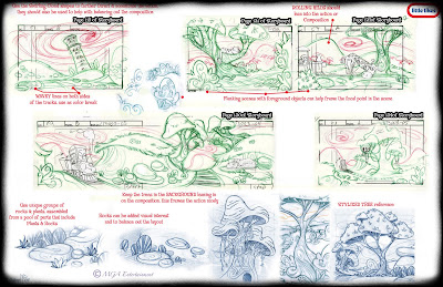
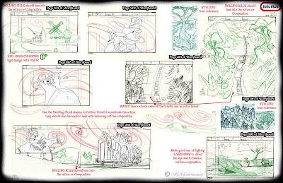
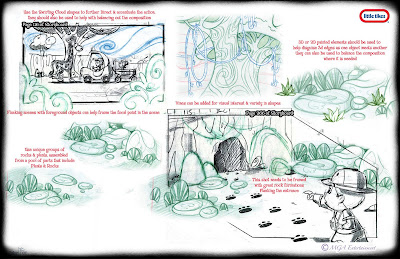
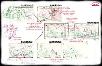
Since the production schedule was so compressed, with a very small window for design comments & corrections, we used the storyboard phase to effect lighting, staging and the adding in of missing elements from props to full blown backgrounds. If we didn't catch it here, there was no time to go back & add it in later. Here are a few examples of how I communicated these adjustments.

Title Card & End Credit Backer Designs . . .


Here are the Title Cards & End Credit Backer Designs for the four shorts on this first DVD. This was a great exercise in simplified design. The color was minimal and the elements were few. I pored over old movie cards for inspiration and there is a great deal of beautifully designed work to be inspired by!

DVD Final Renders . . .


Great little stories, cute characters & adorable music!